MAZIK CARE
- STRATEGY
- VISUAL IDENTITY
- UX DESIGN
- PRODUCT EXPERIENCE
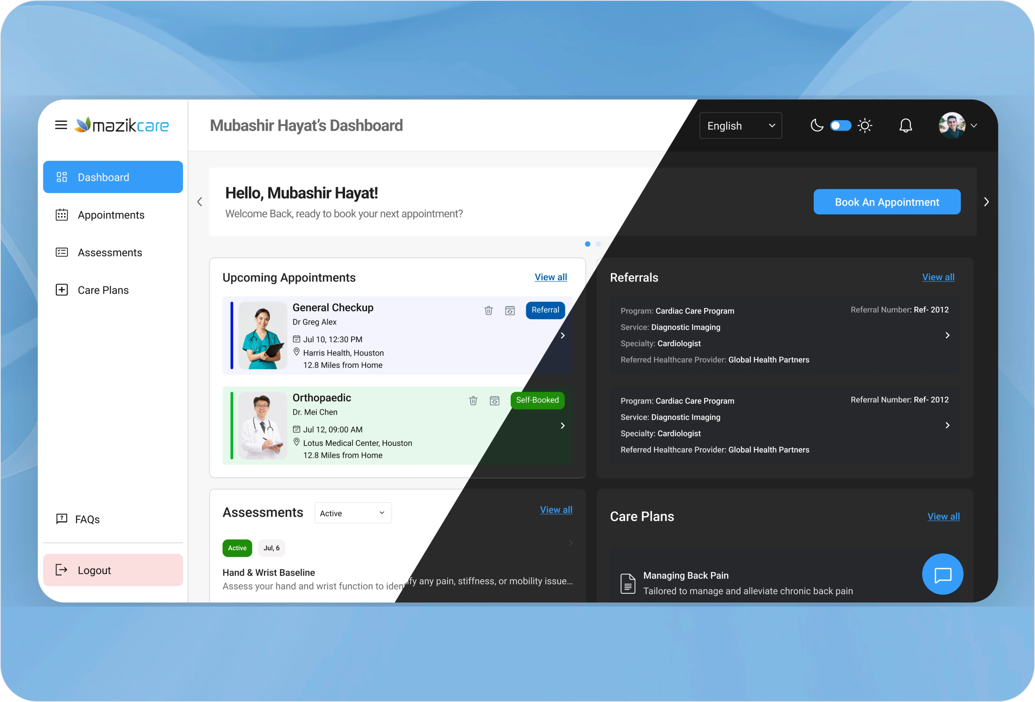
MazikCare unifies healthcare operations from day one, saving time, reducing friction, and letting providers focus on patients.
Healthcare platforms are notorious for "UI debt", cluttered interfaces that force doctors to fight the software before they can treat the patient. For MazikCare, the challenge was operational noise: disconnected screens and fragmented data paths weren't just a nuisance, they were a tax on time and a risk to patient outcomes.
The Goal
Consistency
Bring the interface in line with the design language of modern healthcare apps patients and providers already trust.
Simplicity
Design intuitive, patient-first user flows that reduce friction at every step.
Fewer Clicks
Cut down the "click-to-care" ratio, so providers spend less time navigating and more time treating.
Accessibility
Ensure the experience works across age groups, abilities and comfort levels with technology.
The ByteCorp Studio Approach
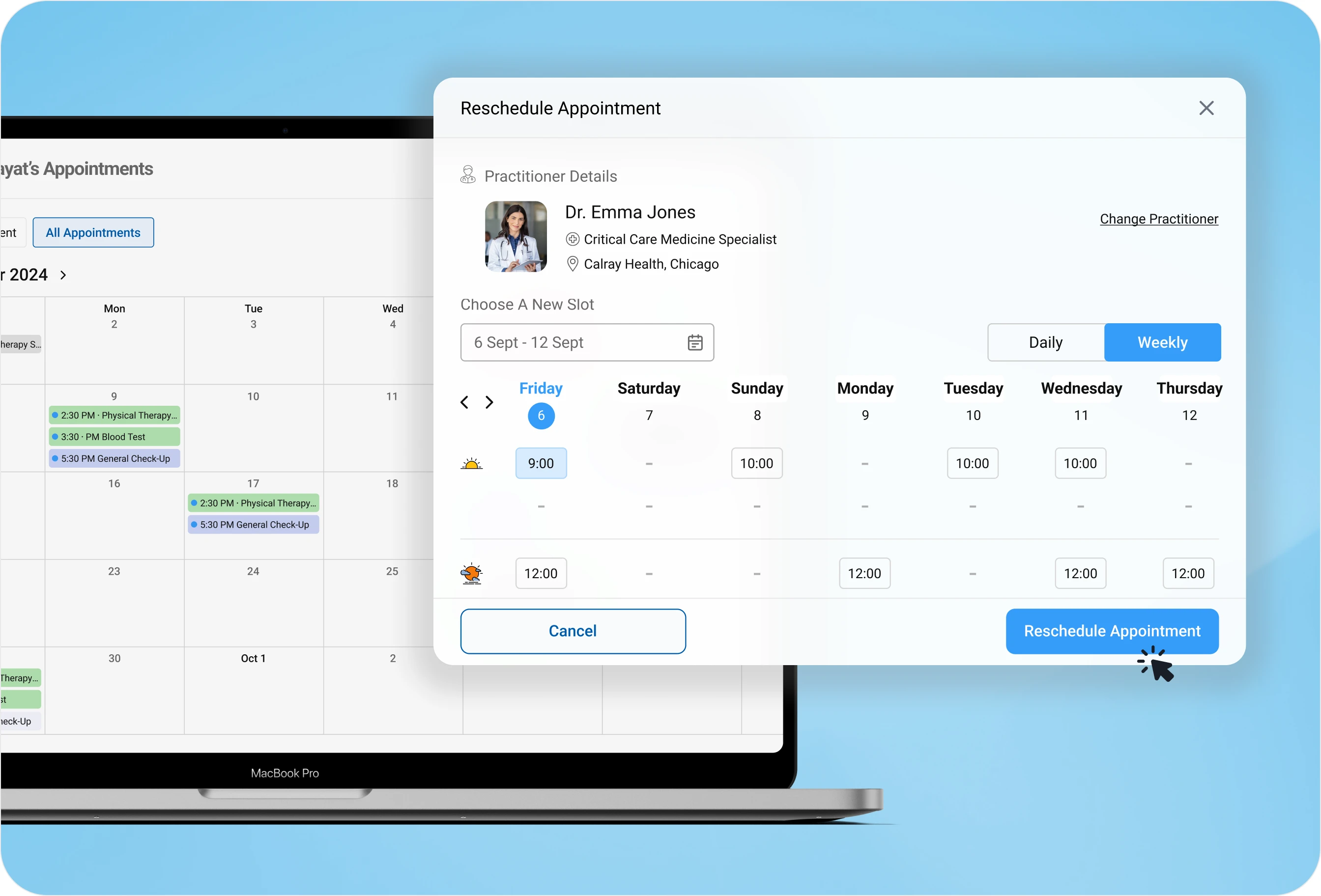
We approached MazikCare not as a software interface, but as a cognitive load problem. By mapping how providers actually move through their day, we designed a visual hierarchy that surfaces what matters now and hides what doesn't. The interface itself became the instruction, intuitive enough that a clinician could pick it up on day one without training. We rebuilt patient-facing flows around clarity: fewer steps, clearer actions, visual feedback that confirms something happened.
The Impact
Zero-Day Adoption
Intuitive design meant immediate fluency, no weeks of staff retraining.
A 40% Efficiency Gain
Streamlined navigation cut the click-to-care ratio nearly in half, reclaiming hours for providers every shift.
Operational Clarity
Dense healthcare data became visual intelligence, helping leadership spot bottlenecks before they impacted outcomes.
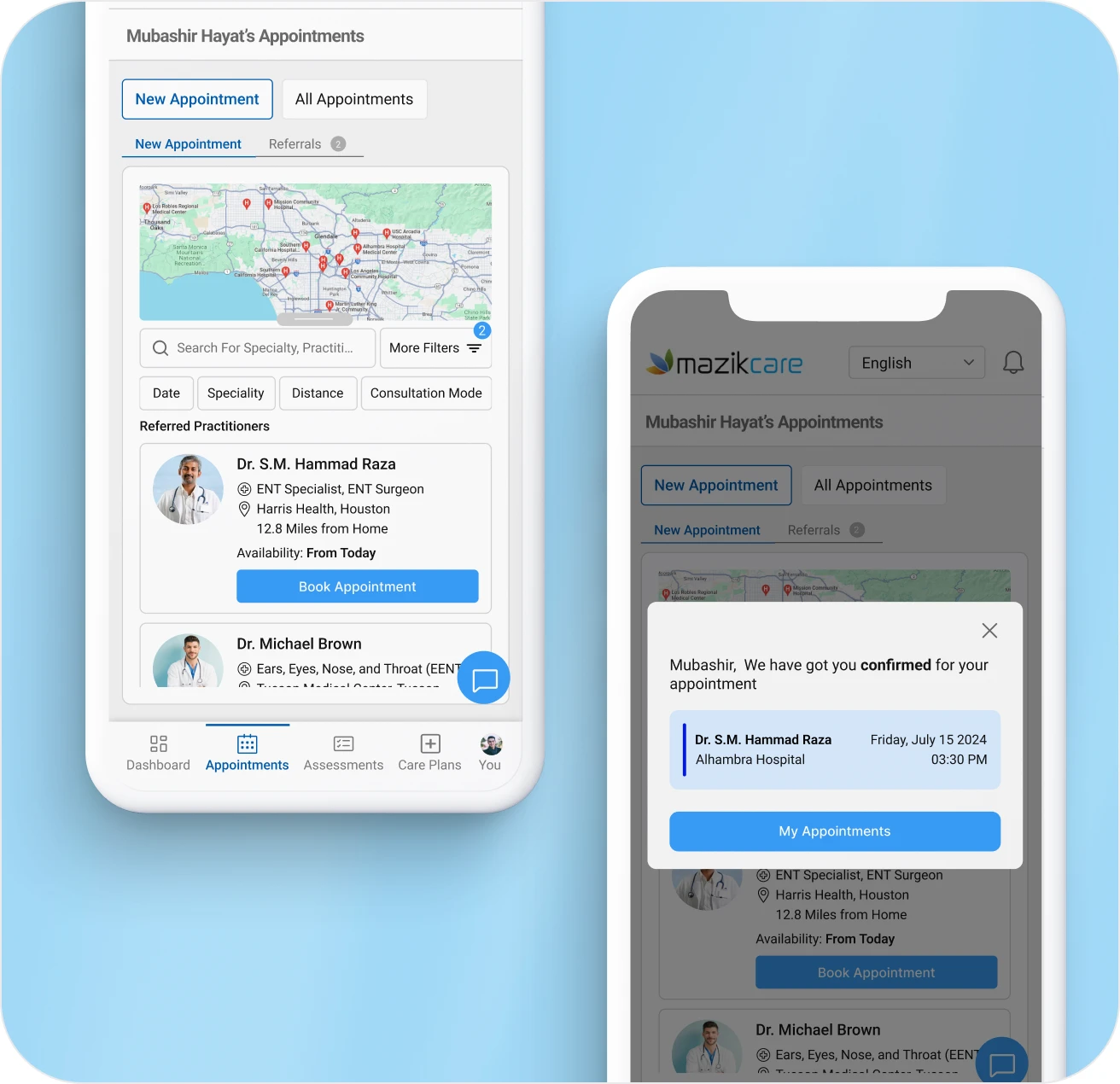
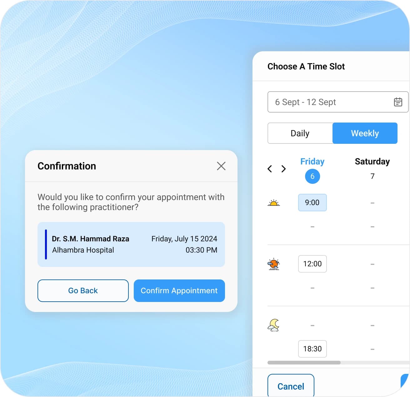
Through ByteCorp Studio's design approach, MazikCare evolved from a utility tool into a strategic asset. We didn't just change how the platform looked, we changed how healthcare moves.
“Their creativity, attention to detail, and user-centric approach set them apart, I highly recommend them for any UX/UI-related project.”